Fruttare / Solero
Rebranding
2018 - Great Cases of Packaging / Grandes Cases de Embalagem - organized by EmbalagemMarca magazine /
2018 - Great Cases of Packaging / Grandes Cases de Embalagem - organized by EmbalagemMarca magazine /
We created the new packaging for the whole product line, keeping the iconic elements that everybody recognises and improving the iconic brand's visual concepts.
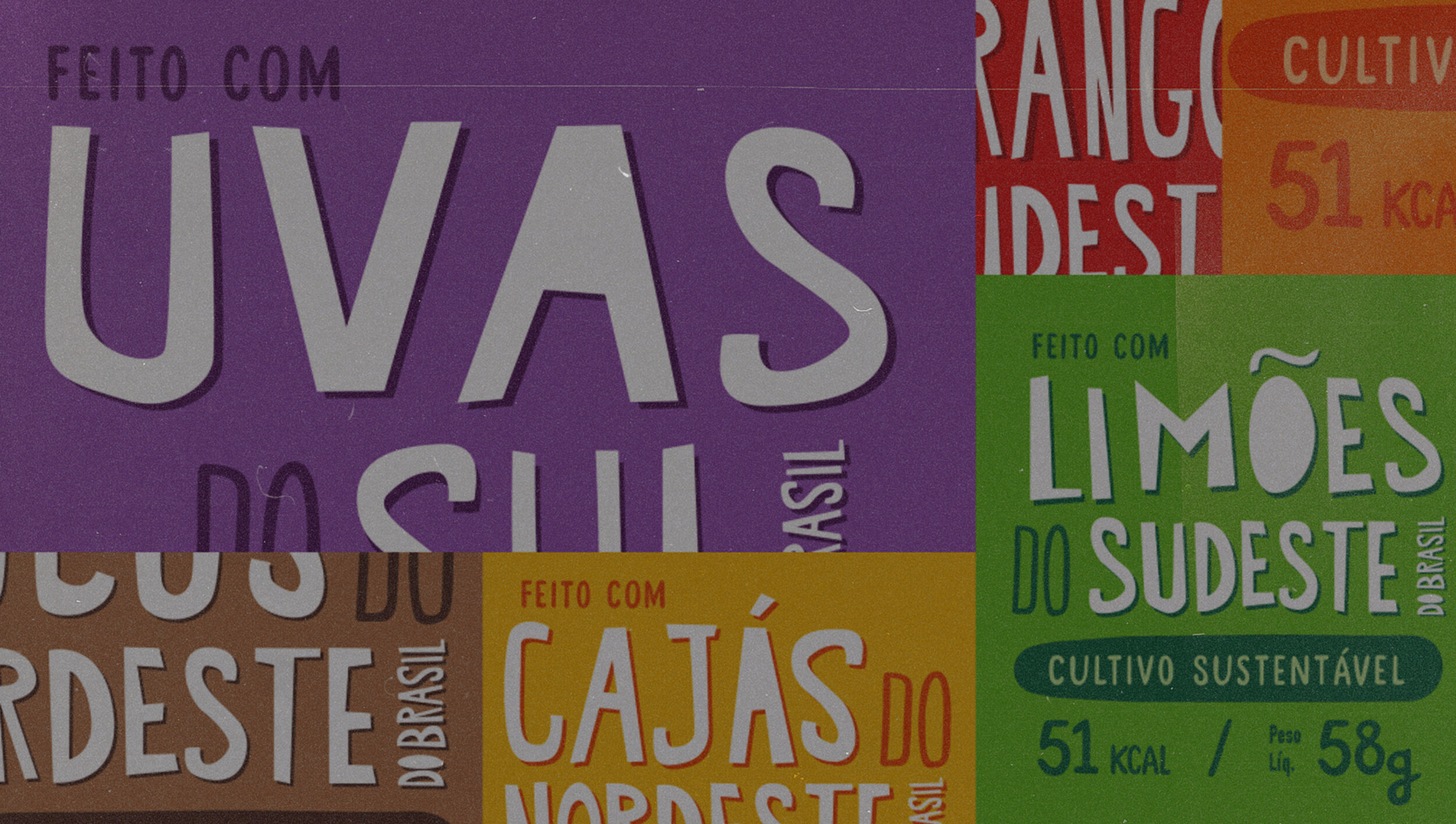
Real photos, which stand apart from the traditional digital illustrations used in the category, showing the fruit up close in natura, still on the branches.
Also, the quality of the fruit's origins is protagonist in every different flavour.
This new packaging design for the ice cream line was one of the Great Cases of Packaging 2018, organized by the EmbalagemMarca magazine - a reference in Brazil’s packaging sector. The winners were chosen based on the following criteria: Innovation, Technology and Economic And Environmental Impact.
With the productive chain in sight since its early stages, including where the fruits are produced and who actually produces them, we have created (with partners Questtonó) a clear and genuine language, getting rid of excessive graphic resources and highlighting what really matters for this packaging design: fresh, natural fruit.
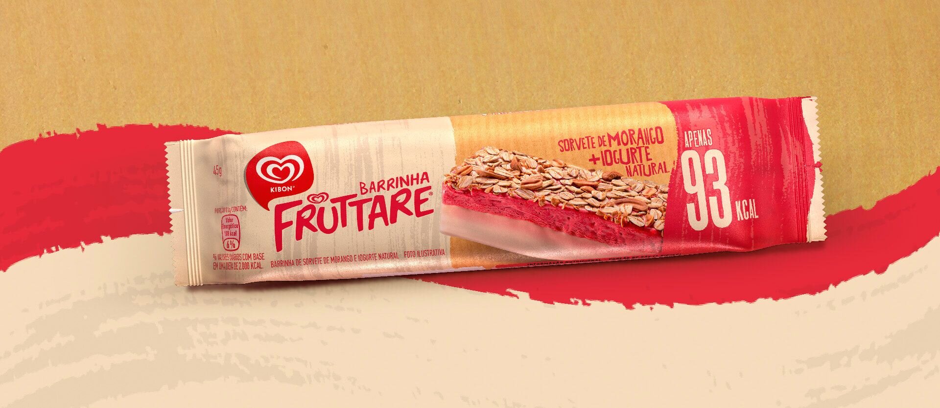
Besides revamping the packaging of all current flavours, we also created a new concept for the new product line "Muita Fruta”. The new flavours – made of only four and far more natural ingredients – called for an updated and transparent style. After all, modern customers are increasingly connected with and demanding about the origins of the products they buy.


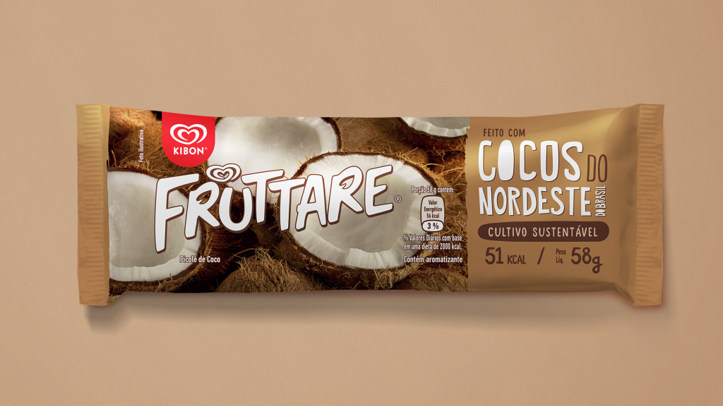


Totally inspired by traditional Brazilian vernacular typography, the original handmade type creates a great combination with messages like “Strawberries from the Southeast” and “Coconuts from the Northeast”, reflecting an even more rustic and handcrafted feel to the packaging design.
The brand's rebranding and new positioning also resulted in the creation of a new product and it’s packaging. An unprecedented global innovation in the ice cream sector:
Fruttare Nut Bar
(Barrinha Fruttare)

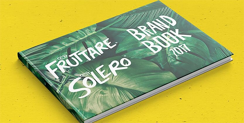
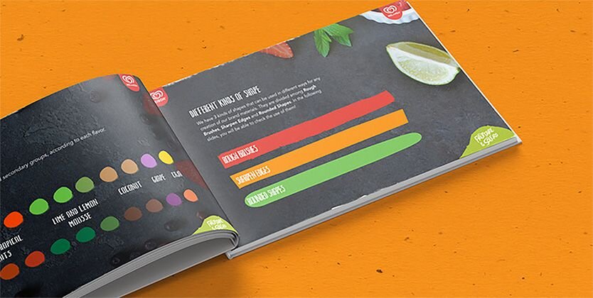
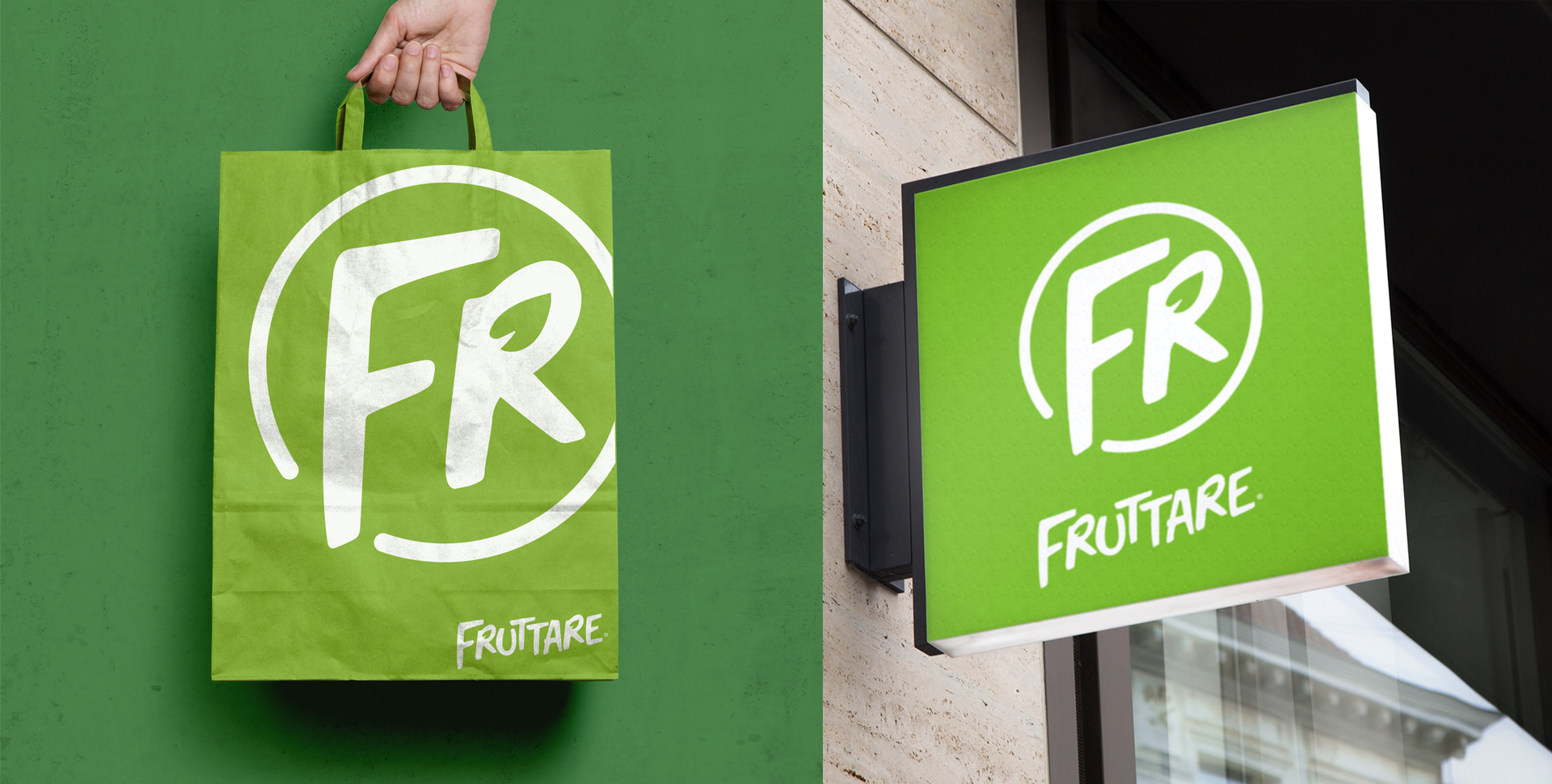
The whole branding redesign (Fruttare in Brazil, Solero in the rest of the world) also originated a new Global Brand Book for these Unilever’s brands.


Recognition
2018 - Great Cases of Packaging / Grandes Cases de Embalagem - organized by EmbalagemMarca magazine
My Contribution
Concept, Creative Direction
Contributors
CCO: Lucas Mello
Creative VP: Mauro Silva
Art Director: Fabio Frencl, Rogério Castro
Copywriter: Thiago Costalonga
Design Studio: Questtonò
Photography: Ultima Filmes
Packaging print: Inapel (via Unilever)
Agency: ℓiⱴε (formerly LiveAD) (São Paulo)
Year: 2017